Mobile Phone Customer Experience Dashboard - Design Case Study
The project
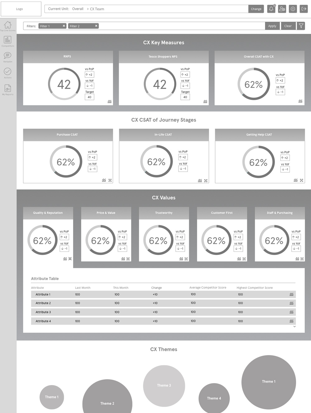
I created the UI and UX design of emails, a survey and a web-based survey analysis dashboard product for this well-known mobile phone supplier. The implementation of KPMG's Insight Cloud dashboard product was used to improve the client's customer's experience (CX) and was populated by data from the customer satisfaction survey. Customers were invited by email to complete the questionnaire. This project took place mostly during the Covid 19 lockdown of 2020.
The brand name is hidden in the screen shots to provide some client confidentiality, and dummy data is used to protect client data.
My role
As the senior UI and UX designer I created sketches, wireframes, mock-ups, prototypes and crafted all the HTML, CSS and the front-end user interface elements, ensuring the dashboard and survey was fully mobile responsive, accessible, met user needs and was easy to use. I led on all the UX design decisions, and I worked alongside project managers, account engagement managers, data and insight analysts and product manager to deliver the dashboard product, emails and survey.
Discovery phase and researching the problem
The client previously used two core products to collate customer feedback, but both were poorly designed and not user friendly. A bespoke dashboard design was needed that brought the core customer experience feedback to life.
Client scoping
Video conference meetings with the client determined business aims for the use of the dashboard and the questions that the wanted in the Survey.
Internal scoping
Video calls internally determined what was in project scope and how to best achieve the client's aims.
Defining the user and client requirements
A schematic document in Excel mapped the survey questionnaire answer types to the types of charts on the dashboard.
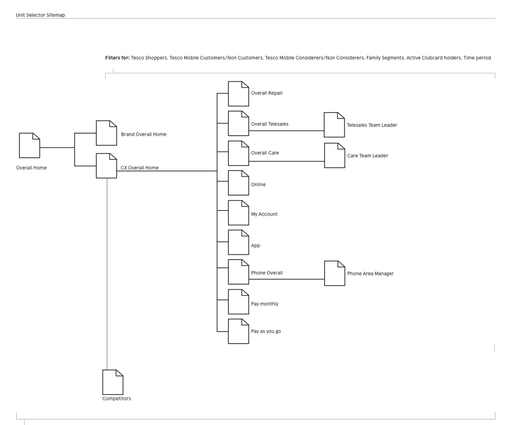
User journey and user flow
In remote video conference meetings, we held brainstorming sessions with sketched ideas in Invision (from Sketch) and in PowerPoint detailing each chart and infographic each user group could see, and the basic information architecture. I presented a sitemap and basic user flow, which informed our direction.
Research
I used client meetings to better understand the types and groupings of users and their particular needs, in using the new dashboard.
User groups and personas
GOALS:
- Top-level scores on CX problem scores.
FRUSTRATIONS:
- Too much detail, or too little.
DASHBOARD USAGE:
- PC and desk based.
GOALS:
- Team performance monitored against targets.
- Create recommendations from the feedback for the team.
FRUSTRATIONS:
- Customer feedback needs good theme categorisation.
DASHBOARD USAGE:
- In office for top-level reporting.
GOALS:
- To gain insight in how to strategically improve the brand perception.
FRUSTRATIONS:
- Reputation feedback is often unclear.
DASHBOARD USAGE:
- Desktop PC at home currently.
GOALS:
- Top-level team feedback of brand performance.
- View the data, themes and comments to identify marketing issues.
FRUSTRATIONS:
- Reporting on previous platforms was laborious.
DASHBOARD USAGE:
- PC in an office.
GOALS:
- Team performance monitoring against targets.
- To view easily where the team’s performance was below that of other teams.
FRUSTRATIONS:
- Accuracy of cross team performance needs improvement.
DASHBOARD USAGE:
- In shop usually, now remote online sales.
GOALS:
- Identify customer service areas for improvement.
- Actions planning required to improve low scoring areas.
FRUSTRATIONS:
- Customer retention problems need quicker turn around.
DASHBOARD USAGE:
- Desktop PC, currently remotely.
Design development of potential solutions
From the client requirement phase we refined our ideas based on what we had discovered.
Ideation – brainstorming
With further client and internal video calls we determined a structure of the dashboard based on key user divisions and started to understand the key chart types and required infographics.
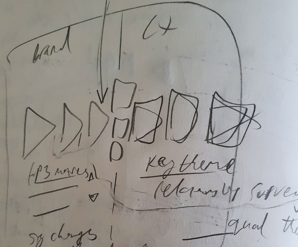
Sketching, wireframes and iterating on user feedback
The core layout, structure and content were sketched out in my sketchbook. Low and mid fidelity designs were shared with the client for rapid user feedback, iterating the designs and improving them.
Design delivery
I created a variety of design assets for this project:
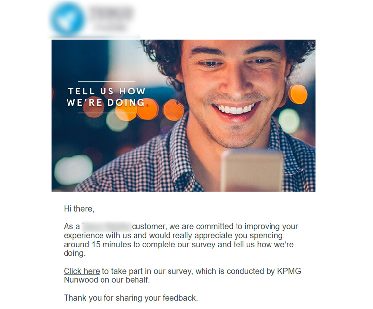
Survey invite email design
- Designs in Sketch.
- Imagery in Photoshop CC.
- Prototypes in Invision.
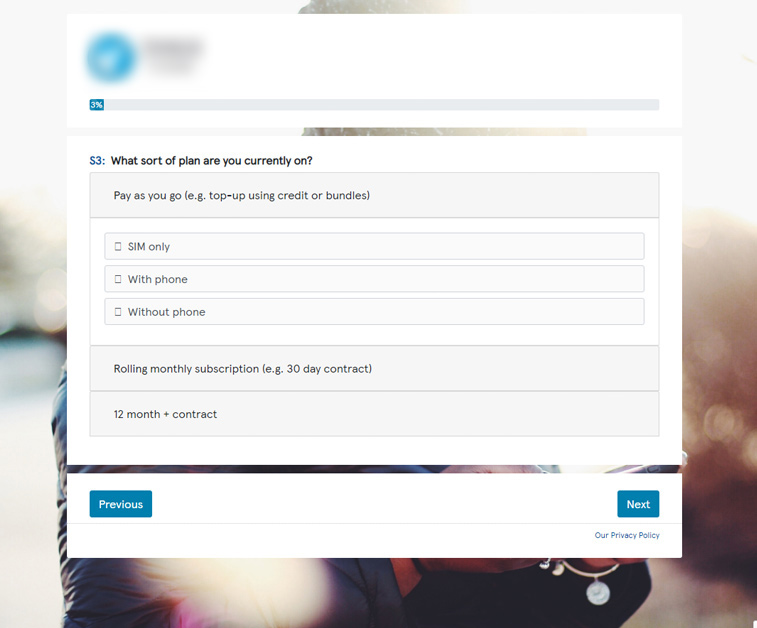
Survey designs
- Designs in Sketch.
- Prototypes in Invision.
- Some mock-ups in HTML.
Low fidelity dashboard wireframes
- Designs in Sketch.
- Prototypes in Invision.
Final designs
- Fully branded designs in Sketch.
- Prototypes in Invision.
Build phase
The main components of the product were rolled out to the client with several build phases.
Email build
- CSS, images and fonts supplied to developers for the email software.
Survey build
- CSS, images and fonts supplied to developers for the survey software.
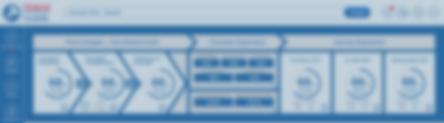
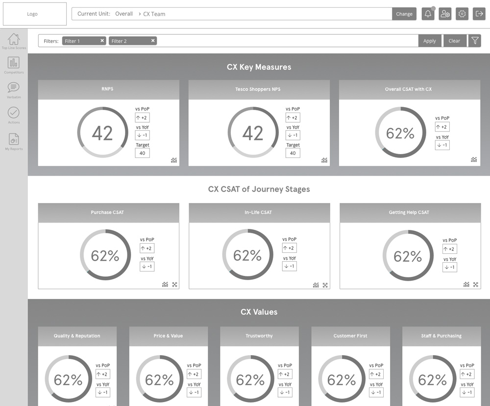
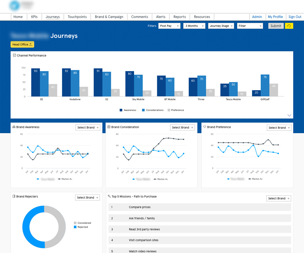
Dashboard build
- Best practice in code and security, with Agile sprints.
- Charts and data were provided by Implementation Team colleagues, and I styled the data visually and graphically.
- HTML, LESS, CSS, images, fonts and front-end user interface elements were added to the product using GIT.
- I styled Highcharts JS plugin for Dashboard charts.
- The product was a fully responsive, mobile web delivered piece of software.
Support phase
There was an incremental delivery of the product in an agile way, with releases on a UAT test site for the client to view with a variety of bug testing and refinement stages.
User feedback and iteration
- UAT testing, usability testing accessibility and QA.
- Observations of users using the dashboard.
- Stakeholder feedback sessions.
Results and reflections
Problem areas in customer experience were addressed through this project, and feedback was gained through the dashboard to substantially improve the brand marketing. This led to an increase in revenue and a return on investment for the client with the product.